Font Tricks
Introduction
Until I find a graphic artist willing to work for free coffee, I have to work with fonts. A lot. Sometimes, I'm given some serious problem fonts, and I have to work out a solution for a design element. More often than not, I'm given a logo as a tiny, over-compressed JPEG, and I need to put it on a 24-foot billboard on a patterned background. Or, even worse, I get a physical, ink-and-paper, business card and have to turn the logo into a scalable graphic.
In my short stint as a fill-in graphic artist, I've developed a couple tricks you might like to quickly build scalable graphics (mostly fonts) out of garbage source images.
First, I'm going to discuss Inkscape a lot. It's a fantastic vector editor, and makes a lot of tasks very simple. Additionally, I'm going to assume you understand the basics of a bezier path. Working with vector paths in Inkscape is very simple and intuitive. There are a lot of different ways you can manipulate bezier paths, and what you pick will be more a matter of practice and experience. So, if that all sounds like normal stuff to you at this point, read on.
I just want to point out a quick note on why I use Inkscape, in particular, for this task. First, its native format is SVG. Unlike other (perhaps more ubiquitous) vector formats, SVG is open. AI (Adobe Illustrator) suffers from being proprietary, and EPS is more print-specific. Also, if you need your SVG file to be converted into either of those, it's usually quite trivial.
WTF: What the Font?
If you're a budding graphic artist, and you haven't run into What the Font? yet, here is your introduction to a pretty amazing design aid. The basic idea is that if you have some image of text in a particular font (say from taking a picture of an outdoor sign), you can feed that image into this site, and it will analyze the little quirky shapes in the various glyphs (even if you don't have very many glyphs available), and it will produce a list of possible fonts used to make up the type in your image.
Obviously, this is using some rigorous edge detection, so the better edge contrast you have, the better your results. It's sometimes helpful to bring your image into a raster editor (e.g. Gimp, Photoshop, etc), and greatly increase the contrast, or even try to cut out the glyph shapes and make them an alpha mask for a black-and-white version of the image (in the case of particularly bad source images).
When recreating vectored type, this is one of my first tools. Many times, I already have the font on my system, I just wasn't able to quickly identify the font being used. But, if you don't have the font already, there are a couple options. First, search the web (or use the links from WTF) to find out if the font is open source or public domain. If so, you're in luck! Download, install, and off you go. If not, don't worry. That's what the next section of this guide discusses.
No Font, No Problem
So, let's take the case of recreating a scalable font when you don't actually have the font (either you can't find the font file in the format you need, or it's only obtainable by purchasing an expensive set of fonts that you'll never use again). I'm also going to assume that the original image you have is of very poor quality, but represents relative size and composition accurately (like a tiny image file, or a scan of a business card). I also assume, the amount of text that you need to re-render is relatively short (e.g. the name of the company or a short tag line).
The first thing to do is get a high-quality pre-render of the text in the desired font. To do this, you can usually just go to a font distributor such as fonts.com, and find the font you want to work with. Most of these sites have a font preview tool into which you can enter your own sample text. So, type the (hopefully short) string of text you need to recreate, and blow up the preview font size as large as the tool allows. Most of these sites use a server-side font renderer to produce a preview image of the letters in that font. If you can't just right-click and "Save Image As..." you can always just use your desktop's screen capture facility and make your own image of the text.
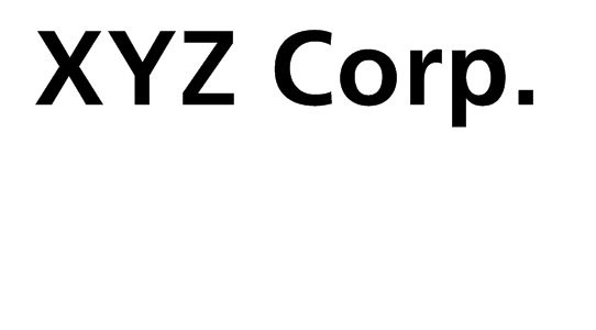
At this point, you should have a relatively good size (48-72 point) image of the text you need to scale with sharp, black letters on a white background. If you do, proceed to the next section.
Vectorizification
Open up Inkscape and import the image of the text you need to turn into a vector.
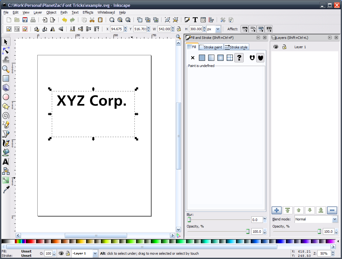
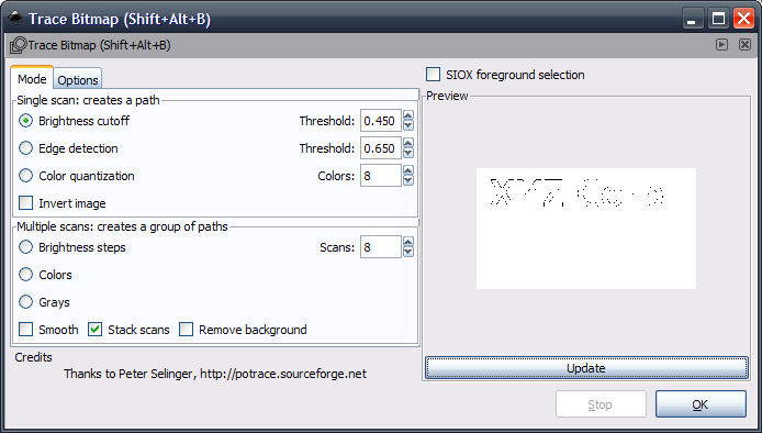
With the image selected on the canvas, use the trace tool under Path -> Trace Bitmap. I show the settings I used for this example, but you can clearly see there are various options you can adjust to improve tracing a particular path. Since this is probably a best-case scenario for bitmap tracing, the most basic settings work quite well.
Back on the canvas, the path that was created is now selected as the active object. You might want to move it to a different layer so it's easy to hide/show/compare the original image. (Using "Paste in Place" saves some headaches here.)
When using fancier fonts (or more complex shapes) the tracer isn't always going to do such an awesome job. If that's the case, I will usually change the new path's fill color to pure red with about 80% opacity. This should give you a good idea of how well the vector matches the original shape. As you can see from a close-up of the "X," there is a little error on the corners where the original renderer did some anti-aliasing on the shallow corners. To clean this up, just switch into the path edit tool (F2), and you'll see the nodes the tracer built.
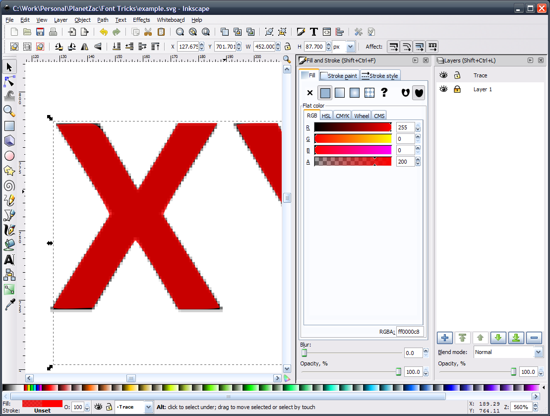
In this example, there was some rather elaborate attempt to minimize nodes that left one off of the corner. So, I just adjust the nodes accordingly to clean up the edges. Repeat the process for any other glyphs that have obvious boundary issues.
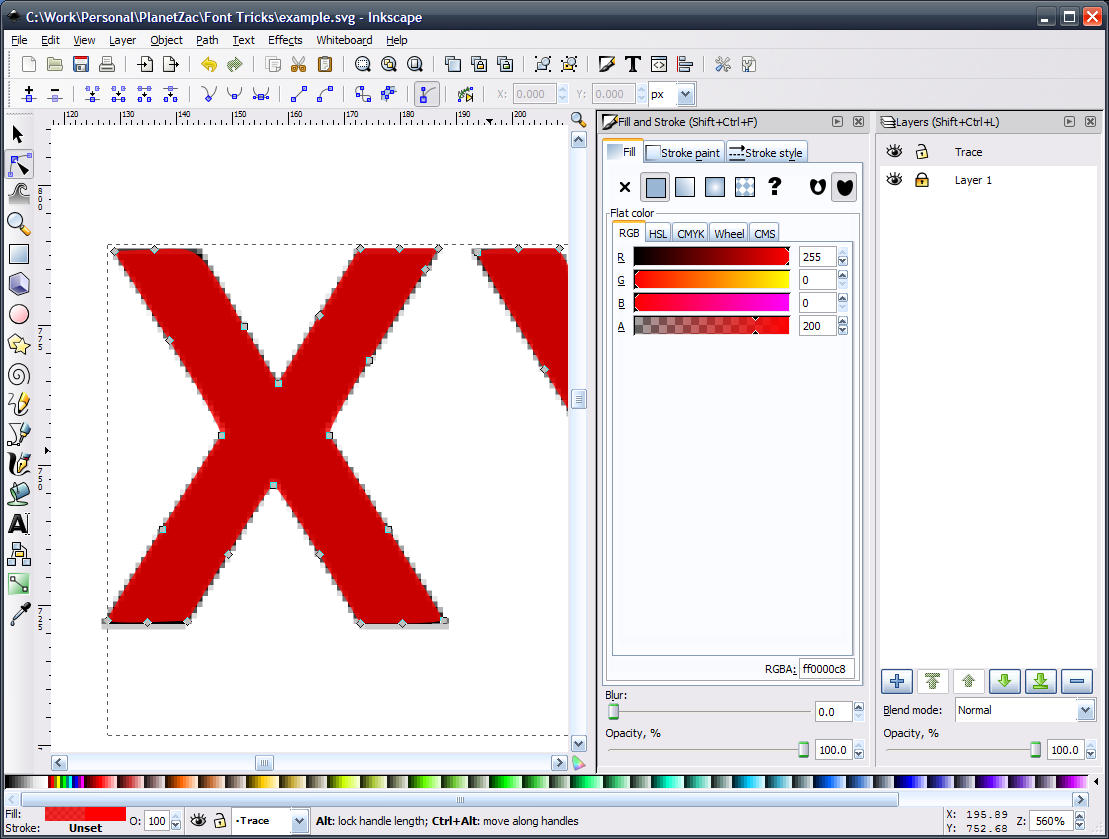
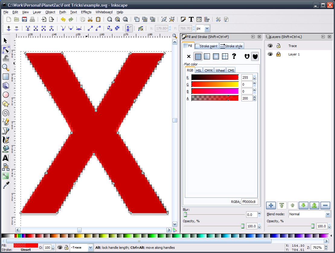
You might notice the jagged edges in the zoomed-in canvas. In this example, that's the feathery pixels along the diagonal and curved edges used to anti-alias those lines so they appear smooth at lower magnification. When working with traced bitmaps, I generally try to run my paths about 50% between the lightest pixels and the pixels that are solid. If you try to include the lightest pixels, you'll get a slightly distorted version of the glyph that is "bolder" than the original. If you only trace over purely solid pixels, you might get a thinner glyph. In either case, just be consistent with how you trace and you can use path tools later to make any large-scale adjustments.
Implementing
At this point, you should have the letters you need in a perfectly scalable format. Granted, you can't go off and type new phrases in this font (unless they only consist of the glyphs you've traced), but you can now position the type over your source image, and scale/rotate/whatever until it fits the original to whatever tolerance you're willing to deal with. The more difficult adjustments might involve aspect-less scaling of the original font which means you have to eyeball the new dimensions. You will also usually run into kerning differences, but that's usually just a matter of using the path tool, highlighting all the nodes of a single glyph, and repositioning it within the overall object. You can hold Ctrl while moving the glyph to constrain it to horizontal movement.
Conclusion
I hope this has been a useful little guide to quickly reconstructing font vectors. The same basic principle is easily used to quickly turn simple (and sometimes not-so-simple) shapes into vectors. Usually, the most time-consuming work is just making small, manual tweaks to the traced path. Therefore, I caution someone who sets out to trace a lot of text that might be in a very decorative font.